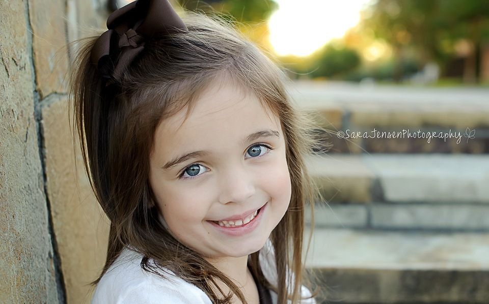
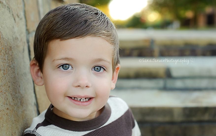
And here is my take on both sketches:
I had to take some creative liberties with both, to accomodate my photos...On the top layout, I added a second photo to the blank space in the sketch. Because I did so, I needed to move the title down. On the bottom layout, I had to crop my photos larger than the suggested 3x3 because they were printed in 4x6, so I cropped to 4x4. Due to a lack of room, I moved the top flourish to the bottom with the other one (by the flower). I added the layered flowers to this layout so it would complement the other, and then used another scallop frame to record the date, instead of including a second title. TFL!!!


.jpg)
1 comment:
I love your LO so cute!! I want to let you know I have given you an award come to my blog and see.
Post a Comment